How publisher and printer marks help date and value vintage postcards
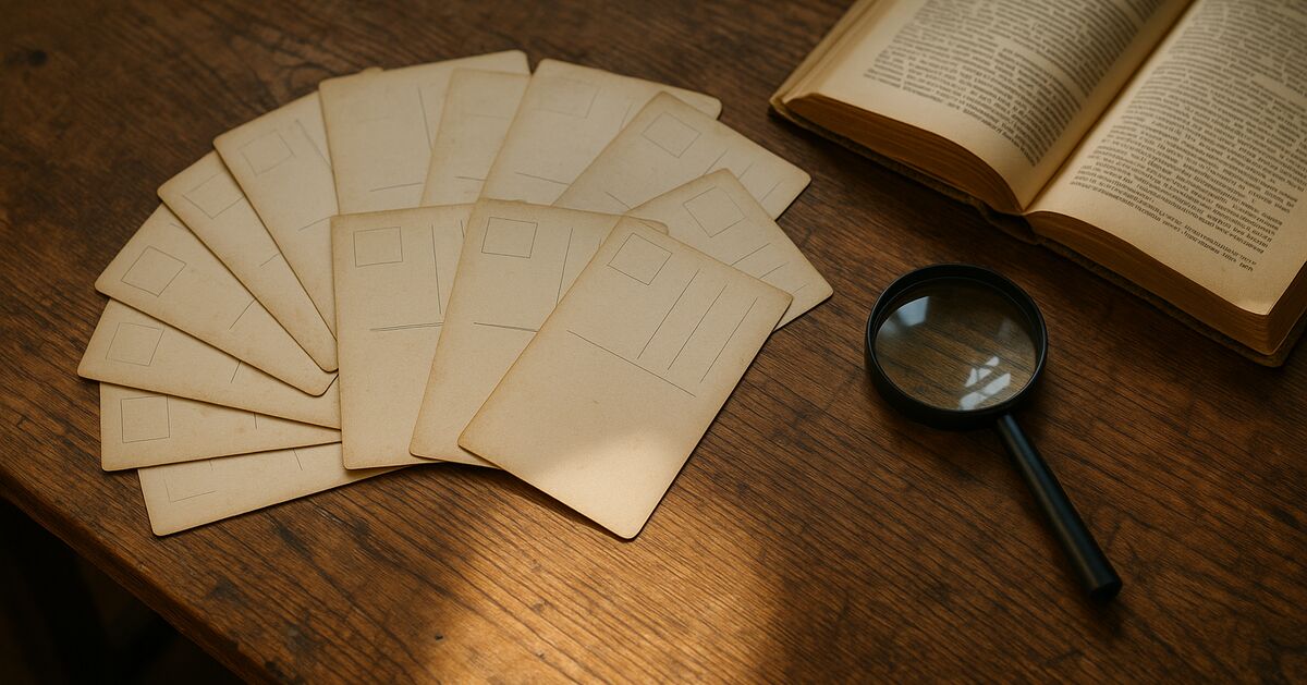
Flip any old postcard over and you will often find something printed in the divided back's lower margin - a name, a city, a series number, a tiny logo, or a cryptic abbreviation. Most beginners ignore all of it. Experienced collectors treat it like a fingerprint. Those marks can tell you where a card was printed, roughly when it was made, who commissioned it, and sometimes why a copy in near-mint condition is worth ten times the same scene printed by a different publisher. This guide walks through what to look for and how to interpret what you find.
For the complete reference, see my guide to dating old postcards.
Why publisher identity matters at all
Before diving into how to read the marks, it helps to understand why they matter in the first place.
Postcard collecting has always had a hierarchy of publishers. Certain printers - particularly German chromolithography houses operating before World War I - produced cards whose color saturation, paper stock, and fine-screen halftone detail have never really been matched. When a collector sees a mark identifying one of those printers, they know they are looking at a card that was made with more care and better materials than the average souvenir card from a decade later. Condition still matters enormously, but the publisher mark is often what separates a $2 card from a $40 card of the same subject.
Publisher identity also feeds directly into series research. Many publishers issued numbered sets, and knowing the publisher lets a collector cross-reference checklists to find out whether a card is common, scarce, or the last one needed to complete a run. That last distinction can move a price dramatically.
The golden age of German printing (roughly 1898 to 1914)
German printers were widely used for postcards sold in the United States and Britain during the Edwardian era. American publishers would commission artwork, then ship the designs overseas to be printed by German chromolithography firms whose presses and inks were simply superior to what was available domestically. The finished cards were exported back to the U.S. and sold at newsstands, general stores, and druggists.
Look for phrases like "Made in Germany", "Printed in Germany", or "Saxony" on the back of a card. The presence of any of those phrases is a strong indicator that the card dates before 1914, when World War I effectively severed the trade relationship and American publishers were forced to develop domestic printing capacity. Cards reading "Made in Bavaria" are similarly pre-war. If you see "Made in Germany" after about 1920, the trade had resumed but the artistic golden age had largely passed.
Some specific German printers to know:
- Meissner & Buch (Leipzig) - known for high-quality color work and greeting card series
- Stengel & Co. (Dresden) - famous for fine art reproductions and architectural views
- Ottmar Zieher (Munich) - produced vivid scenic and topographical cards with excellent ink depth
- B. Dondorf (Frankfurt) - greetings and novelty cards with exceptional embossing
Finding any of these names on the back of a card is meaningful. It narrows the date window, confirms premium print quality, and often elevates collector interest significantly.
American publishers and what their imprints tell you
After the German supply chain broke down around 1914, American and British publishers scaled up rapidly. The marks they left behind create a useful timeline of their own.
Raphael Tuck & Sons is probably the most recognized publisher name in the hobby. Tuck was British but sold heavily in America, and the company's cards carried a distinctive oval logo along with series titles and numbers. Tuck produced both chromolithography and later halftone cards across hundreds of themed series. A Tuck card with a low series number, printed in Germany, is generally considered more desirable than a later domestic-printed Tuck. Learning to distinguish the two takes only a few minutes with a reference guide or a reputable collector forum.
Detroit Publishing Company operated from roughly 1898 to 1924 and holds a special place in American postcard history. Their cards are identified by the "Phostint" process notation, a color printing method associated with the company. Detroit Publishing cards are prized for topographical accuracy and rich color, and their catalog numbers are well documented, making them easy to research. Finding a Detroit Publishing mark on a card you picked up cheaply is exciting.
Curt Teich & Co. based in Chicago is the giant of the American linen era. Their back marks evolved across decades and are among the most useful dating tools in the hobby. A Teich card will typically carry a catalog number that collectors use to estimate the decade of printing and card type, based on established reference guides. Teich kept detailed records, and the Newberry Library in Chicago holds a substantial portion of their archive, which researchers have used to reconstruct production dates for individual cards. If you want to go deep on Teich dating, the Newberry's finding aids are a genuine primary resource.
Tichnor Brothers (Boston) produced linen-era cards with a back mark that often includes the phrase "Genuine Curteich-Chicago" - which can be confusing because Tichnor licensed the Curteich printing process. That licensing relationship means the dating logic for Teich catalog numbers can sometimes be applied to Tichnor cards as well, though with less precision.
For a broader look at what separates quality linen-era cards from ordinary ones, the post on what makes a linen postcard valuable versus common covers the material and design factors that publisher marks alone cannot tell you.
Reading era-specific postal regulation marks
Publisher imprints are not the only dating clue on the back of a card. The postal regulations that governed postcard design changed several times, and printers updated their templates to comply. Those regulatory boilerplate phrases are surprisingly precise date anchors.
- "Post Card" (one word: "Postcard" not yet standard) - cards printed before roughly 1907 in the U.S. often used "Post Card" as two words in compliance with early postal rules.
- "Private Mailing Card" - this phrase was required by the Act of May 19, 1898, for privately printed cards to receive the one-cent postcard rate. A card with this phrase dates between 1898 and about 1901.
- "Authorized by Act of Congress" - appears on cards from roughly 1901 to 1907, when the "Divided Back" era began.
- Undivided back (no line separating message from address space) - standard before March 1, 1907, in the U.S., when the Post Office permitted divided backs. Finding an undivided back with a printed scene usually means pre-1907.
- "Place Stamp Here" boxes and their style - the shape, wording, and positioning of stamp boxes changed by publisher and by decade. A square stamp box with ornate corner decorations is generally earlier than a plain rectangular one.
None of these rules are absolute - publishers sometimes used old plate designs for years after regulations changed - but they are reliable enough to serve as a first filter when you are looking through a large lot.
Series numbers and their collector implications
Most publishers assigned series numbers or set codes to their cards, and understanding how those numbering systems work can tell you a lot about scarcity and demand.
A card that belongs to a well-documented, heavily collected series - such as Ellen Clapsaddle's holiday greetings for International Art Publishing, or Frances Brundage's children's cards for Raphael Tuck - carries meaning beyond the image itself. Collectors who specialize in artist-signed cards will pay a premium for a low print number or a variant edition within a known series. The publisher mark is what allows that identification to happen.
Series numbers can also signal reprints. If a publisher reissued a popular card years after the original run, the reprint sometimes carries an updated series suffix or a changed printer notation. Original editions, particularly those with German printing marks, are more desirable than later domestic reprints of the same design. Learning to spot that distinction is one of the skills that separates knowledgeable buyers from casual ones.
This kind of detective work is exactly what comes into play when you are evaluating an inherited collection. The post on what to do before you sell or split up an inherited postcard album walks through a practical first-pass process that puts publisher research right at the center of assessment.
Printer marks versus publisher marks - they are not the same thing
A point that trips up many newer collectors: the publisher and the printer are often two different entities, and the back of a card may credit both, either, or neither explicitly.
The publisher is the company that commissioned and sold the card - they owned the image rights and the distribution network. The printer is the firm that actually ran the press. In the pre-WWI era, the publisher was often American and the printer was German. After 1914, both roles were more commonly filled by the same American company.
When you see "Published by Smith Stationery Co., Topeka, KS - Printed in Germany," you have both pieces of information. The publisher tells you about the regional market the card was sold into (useful for topographical research), and the printer tells you about production quality and date range. When only one name appears, context clues - the printing style, the paper, the postmark if present - help fill in the gap.
Real photo postcards, or RPPCs, are a special case where neither a publisher nor a commercial printer is typically credited at all, because they were produced from actual photographic negatives rather than printing presses. If you are trying to identify an RPPC, the dating approach is completely different - the post on how to tell if an old postcard is a real photo postcard covers the photographic paper codes and AZO/VELOX/KODAK back stamps that serve as the RPPC equivalent of publisher marks.
Reference tools worth having on your shelf
Reading publisher marks gets faster and more confident with practice and a few key references. The hobby has produced some excellent guides over the decades:
- "The Postcard Price Guide" by J.L. Mashburn - regularly updated, covers major publishers and series with valuation context
- "Postcard Companion" by Jack H. Smith - a solid general reference with publisher identification sections
- The Metropost and Playle's online databases - searchable archives where collector-contributed records can help match publisher names to known series
- The Newberry Library (Chicago) - holds the Curt Teich postcard archive, accessible to researchers and partially digitized
Collector clubs, particularly through the Postcard History Society and regional chapters of the Postcard Club associations, maintain member knowledge bases that no printed guide can fully replicate. When a mark stumps you, posting a clear scan to a trusted forum often produces an answer within hours.
Common mistakes when interpreting publisher marks
A few patterns come up again and again when new collectors start working with publisher information:
- Assuming "Made in Germany" always means high quality - it usually indicates a pre-1914 date, but production quality varied among German printers. A cheap German-printed novelty card is still a cheap card.
- Confusing the publisher city with the card's subject location - "Published by Jones & Co., New York" does not mean the card depicts New York. Publishers often distributed cards of subjects from across the country or world.
- Treating a missing mark as a problem - many cards, especially early ones and locally produced cards, carry no publisher mark at all. Absence of a mark is not absence of value; it just means you rely on other dating clues.
- Overlooking the stamp box style - collectors focus on the main imprint and miss the stamp box design, which can independently confirm or challenge the date suggested by the publisher name.
If a card's subject is a railroad station or depot, publisher research becomes especially layered, because certain regional publishers specialized in depot views and their series are well documented in specialized collector literature. The post on why railroad depot postcards are so collectible gets into how subject matter, regional publisher identity, and scarcity intersect for that particular category.
Putting it all together on a real card
Imagine you find a card at an estate sale showing a main street scene in a small Midwestern town. The back reads: "Published by the Kropp Co., Milwaukee - Made in Germany." There is an undivided back, no divided-back line, and the stamp box has ornate scrollwork. There is no postmark.
From those marks alone you can reasonably conclude: printed in Germany before 1914, published by the Milwaukee-based E.C. Kropp Company (a well-documented regional publisher active from the 1890s through the 1950s), and the undivided back suggests pre-1907. That narrows production to roughly 1898-1907. E.C. Kropp's German-printed cards from that window are among their most collectible, and a sharp main street view with legible signage and people visible would appeal to both topographical collectors and local historians. What looked like a dollar bin card might deserve a second look.
That is the real payoff of learning publisher and printer marks - not just dating a card for its own sake, but understanding what you are actually holding, and making an informed decision about what it is worth to you and to someone else.
For more guides on navigating the vintage postcard world, browse the full blog index or visit the about page to learn more about what this site covers.
About this guide
- Research: Mike Ferreira
- Last reviewed: October 26, 2026
- Primary references: Manufacturer & industry 3 · Government data & agencies 1 (listed below)
- Claim audit: 7 consequential claims checked against the sources below on Oct 15, 2026; wording the sources could not carry was removed (claim-by-claim)
- Spotted an error? Tell me and I will fix it.
Sources & further reading
- Curt Teich Postcard Archives collection finding aid (Newberry Library, Chicago)
- About the United States Postal Service history and postcard regulations (U.S. Postal Service)
- Raphael Tuck & Sons postcard collection (British Library)
- Copyright and the postcard trade - historical background (U.S. Copyright Office)
Revision history (2)
- Oct 26, 2026 - Revised so the advice matches how I buy: whole collections, kept together and described as they are.
- Oct 15, 2026 - Pre-publish editorial QA: 2 flagged, 2 softened; claim audit: 7 claims, 3 rewritten
Claim-by-claim audit (7 checked)
- “The publisher mark can be one factor that meaningfully affects a card's resale value compared to similar cards.” (rewritten to what the article can stand behind)
- “German printers were widely used for postcards sold in the United States and Britain during the Edwardian era.” (rewritten to what the article can stand behind)
- “Their cards are identified by the "Phostint" process notation, a color printing method associated with the company.” (rewritten to what the article can stand behind)
- “A Teich card will typically carry a catalog number that collectors use to estimate the decade of printing and card type, based on established reference guides.” (rewritten to what the article can stand behind)
- “**"Private Mailing Card"** - this phrase was required by the Act of May 19, 1898, for privately printed cards to receive the one-cent postcard rate.” (cited → about.usps.com)
- “Undivided back (no line separating message from address space) - standard before March 1, 1907, in the U.S., when the Post Office permitted divided backs.” (cited → about.usps.com)
- “Detroit Publishing Company is generally understood to have operated from roughly 1898 to 1924 and holds a special place in American postcard history.” (rewritten to what the article can stand behind)
A question first?
Ask before you send anything
Not sure the collection is worth a quote, or what to photograph? Just ask. Every message comes straight to me, and I answer each one myself.