What makes a linen postcard valuable versus common
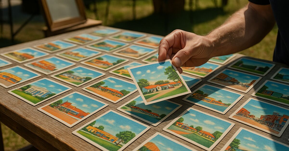
Linen postcards look so similar at a glance that it is easy to assume they are all worth about the same. They are not - and understanding why separates a sharp buyer from a casual one.
For the complete reference, see my guide to linen postcards.
Produced roughly from the late 1920s through the early 1950s, linen postcards get their name from the textured, cloth-like surface of the card stock. That texture was not decorative nostalgia; it was practical. The slightly rough surface held ink better than the glossy real-photo paper of earlier cards, allowed cheaper printing, and made the vivid, saturated colors that define the era possible. Publishers printed them by the millions, which is exactly why condition and subject matter matter so much - scarcity is relative, and not all subjects were printed in equal numbers.
If you are just getting started sorting through a collection, the guide at I Buy Postcards gives useful context on how this site approaches the hobby. The short version: understanding value is always more useful than guessing.
What actually gives a linen postcard its value
Value in linen postcards comes from four overlapping factors: print quality, subject matter, the publisher who produced the card, and the condition of this specific copy. Pull any one of those levers far enough and it can override the others. A spectacular image with bright color can make a mediocre publisher's card worth chasing; a rare subject in poor condition is often still worth more than a common subject in perfect shape. Here is how each factor works.
Print quality: why color saturation is not just aesthetics
The printing technology used for linen postcards was lithographic offset printing, and the quality varied enormously from one publisher to the next and even from one press run to the next. The best examples have:
- Deep, saturated color with clear separation between tones
- No obvious dot pattern when viewed with a loupe or close to the eye
- Crisp edges on architectural lines, lettering, and foreground details
- Sky colors that grade smoothly rather than banding into stripes
- No muddy or grayish cast over what should be vivid areas
Lower-quality print runs show muddy browns and greens, heavy visible dot screens, halos around lettered captions, and skies that go flat and chalky. These were not necessarily bad cards when new - they were the budget end of the market. But today they sit at the bottom of the value range regardless of subject.
Hold a candidate card at a slight angle to a decent light source. A high-quality linen card will show crisp ink sitting cleanly on the texture. A low-quality card will show ink that seems to sit unevenly, with thin spots and color that bleeds slightly into the paper grain. That five-second check tells you a great deal.
Color accuracy also matters, though in a counterintuitive way. The best linen artists took liberties with real-world color - turning skies a theatrical turquoise, making neon signs blaze orange against purple evenings, rendering swimming pools an impossible electric blue. That artistic exaggeration is part of what collectors love. Cards that look drab or photographically accurate often printed from less skilled or less invested artists and tend to be the cheaper mass-market issues.
Subject matter: what sells and why
This is where the real spread in value lives. Some subjects were printed in enormous quantities for obvious commercial reasons - roadside motels, state capitol buildings, Niagara Falls. Those cards exist in huge numbers, so unless the print quality and condition are exceptional, they tend to be priced low at shows and in dealer boxes.
Subjects that command serious attention include:
Roadside Americana with strong graphic design - diners, drive-ins, gas stations, and motor courts that show a distinctive building with bold signage. The building's personality carries the card. A generic motel row rarely excites; a gleaming Streamline Moderne diner with a dramatic parking lot and a readable marquee sign is a completely different proposition.
Black-owned businesses and communities - cards documenting African American resorts, hotels, beaches, and business districts are historically significant and scarce. Collector demand for these appears strong, based on how often they come up in hobby discussions.
Occupational and industrial scenes - workers on the job, factory interiors, agricultural operations with equipment shown in action. These required more compositional effort and were often printed in smaller runs for local or promotional distribution rather than the tourist trade.
Small-town main streets with identifiable storefronts - the more signs you can read, the more collectors want it. A main street where you can make out the druggist, the five-and-dime, and the movie marquee is a local history document. Demand from hometown buyers keeps prices firm even when national collector interest is modest.
Expositions and world's fair venues - linen-era fairs from the 1930s and 1940s produced some of the most graphically inventive cards of the period. Sets issued for the 1939 New York World's Fair, for example, are often of interest to collectors both as complete sets and individually.
Interiors - hotel lobbies, restaurant dining rooms, bar setups, theater auditoriums. Interior shots required more lighting skill and compositional care than exterior views, were printed in smaller numbers, and give a social-history window that exterior cards rarely match.
By contrast, common subjects - generic highway scenes with no identifiable landmark, standard state map cards, plain courthouse exteriors with no human activity - tend to sit in dealer dollar boxes for years. They are not bad cards; they are just abundant.
Publisher marks: who printed it matters
The back of a linen postcard is as important as the front. The publisher's imprint, found in small text on the message side, is one of the first things an experienced buyer checks. A few publishers produced work that consistently holds value; others were known for budget production.
Curt Teich and Company of Chicago is the name that comes up first in most serious discussions of linen postcards. Teich dominated the American linen market for decades and produced cards for clients across the country through a catalog ordering system. Their cards are identified by a code system printed on the back - a number followed by a letter suffix indicating the decade of production (A for the 1930s, B for the 1940s, and so on). Teich cards are not automatically valuable since they made common subjects too, but their top-quality print runs are noticeably superior, and surviving production records for many cards can add research interest.
Tichnor Brothers of Boston produced a large volume of New England subjects and are well regarded for color quality on regional views. Their imprint is familiar to anyone who collects Northeastern Americana.
Colourpicture Publishers also of Boston, printed cards with a warmer color palette and are particularly sought for their New England and mid-Atlantic work.
E.C. Kropp of Milwaukee produced strong Midwestern regional content and is a reliable name for quality.
Stanley Wheelock and smaller regional publishers produced cards for local clients and are worth knowing by name if you collect a specific geographic area.
Generic or uncredited imprints - cards that say simply "printed in the U.S.A." with no publisher named, or that carry a small-town stationery shop's name as sole credit - are often lower-quality productions. They can carry great subjects, but the print quality tends to confirm the anonymous origin.
Learning to read the Curt Teich dating code alone will speed up your evaluation at a show considerably. A "3A" prefix means 1933, a "7B" means 1947. Combined with condition and subject, that date can tell you immediately whether the card fits a collection focus or not. The frequently asked questions page covers some basics about dating and identifying postcards if you want a quick reference.
Condition grading: the practical reality
Even the rarest subject on the best publisher's press run loses significant value in poor condition. The linen surface is more durable than many collectors expect - the texture resists minor surface scuffs better than glossy paper - but it is vulnerable to moisture, which causes waviness and foxing, and to the kinds of damage that come from album storage: corner wear from tight pockets, adhesive staining from black corner mounts, and the slow transfer of dyes from adjacent cards.
Grades used in the hobby run roughly as follows:
- Mint or Near Mint - no marks, no waves, corners sharp, colors bright. Premium pricing.
- Excellent - very light handling, corners nearly perfect, no postal use or one light cancel. Strong demand.
- Very Good - light corner wear, possible light postal cancel, no creases or stains. Solid mid-range value.
- Good - noticeable corner rounding, possible light crease, one or two minor marks. Common range pricing unless subject is exceptional.
- Fair or Poor - heavy use, tears, major staining, serious creases. Value is subject-driven only; print quality becomes secondary.
One detail that surprises newer collectors: a postally used card - one that was actually mailed, with a stamp and a written message - is not automatically less valuable than an unused one. For linen-era cards, light postal use is accepted by serious collectors, and a card with a clear postmark can actually help date the card to a narrow window. Heavy cancels directly over the image on the front are the real problem.
Putting it together: a quick field evaluation
When you pick up a linen postcard at an estate sale or dealer table, run through this in about thirty seconds:
- Flip it over first. Read the publisher imprint. Curt Teich, Tichnor, Colourpicture, Kropp? Note the date code if present.
- Check condition quickly. Run a fingertip lightly across the corners. Feel for waviness. Hold it up to see if there are creases catching the light.
- Look at the subject. Does it have a readable sign, a distinctive building, an occupational scene, or documented historical interest? Or is it a generic highway view?
- Evaluate the color. Saturated and vivid or muddy and flat? Are edges crisp?
- Consider the message side. Is there handwriting? A postmark? These add human interest and sometimes documentary value.
That sequence handles the great bulk of what you will encounter. The cards that need more research - suspected rare subjects, unusual publisher imprints, possible artist-identified work - are a small fraction of what passes through a typical collection.
For a sense of how condition and subject interact in a related area of the hobby, the post on antique Halloween postcards from 1905 to 1915 walks through similar considerations for an earlier period. The logic transfers: great subject, great condition, identifiable publisher - the same variables keep appearing.
Common mistakes when evaluating linens
A mistake that comes up again and again in collector forums is over-weighting novelty. A card that shows something funny, risque, or unusual to modern eyes is interesting - but interest and value are not the same thing. Humor cards and novelty linens were printed in huge runs precisely because they were popular. Popularity then means abundance now.
Another recurring issue is confusing the textured surface with quality of printing. The linen texture is a property of the card stock, not the printing. A cheaply printed card and an expertly printed card can have an identical surface feel. The color depth and dot structure tell you more than the texture does.
A third mistake is ignoring the back entirely. The publisher imprint, date code, and caption text on the reverse are part of the card's identity. A card captioned vaguely as "Greetings from the South" is worth less than an identical view captioned with a specific town name, business name, or year. Specificity drives value in linen postcards just as it does across the broader postcard collecting hobby.
Where linen postcards fit in a broader collection
Linen postcards occupy a specific and well-loved niche. They are affordable enough that a focused collector can build a meaningful thematic collection without spending collector-grade money on every card, but the range from common to rare is wide enough that developing a sharp eye pays off. A good eye for print quality and publisher marks will save you from overpaying for average material and help you spot genuine finds in mixed dealer lots.
If you have come to linen postcards through an inherited collection, the advice in the post on what to do before you sell or split up an inherited postcard album applies directly - looking through the cards by publisher and subject, without taking them out of the album, will give you a much clearer picture of what you actually have.
And if you are curious whether any cards in a mixed collection might be real photo postcards rather than linens, the guide on how to tell if an old postcard is a real photo postcard will walk you through the distinction quickly. Getting that identification right matters, because RPPCs and linens serve different collector markets and price at very different levels.
Linen postcards reward the patient, observant buyer. The common ones are common. But the good ones - sharp color, strong subject, reliable publisher, sound condition - are a genuine record of mid-century American visual culture, and the collectors who learn to find them consistently are the ones who took the time to understand why the difference matters.
About this guide
- Research: Mike Ferreira
- Last reviewed: October 26, 2026
- Primary references: Government data & agencies 1 (listed below)
- Claim audit: 5 consequential claims checked against the sources below on Oct 15, 2026; wording the sources could not carry was removed (claim-by-claim)
- Spotted an error? Tell me and I will fix it.
Sources & further reading
- Offset Lithography and Commercial Printing History (U.S. Government Publishing Office)
Revision history (2)
- Oct 26, 2026 - Revised so the advice matches how I buy: whole collections, kept together and described as they are.
- Oct 15, 2026 - Pre-publish editorial QA: 1 flagged, 1 softened; claim audit: 5 claims, 4 rewritten
Claim-by-claim audit (5 checked)
- “Those cards exist in huge numbers, so unless the print quality and condition are exceptional, they tend to be priced low at shows and in dealer boxes.” (rewritten to what the article can stand behind)
- “Collector demand for these appears strong, based on how often they come up in hobby discussions.” (rewritten to what the article can stand behind)
- “Teich cards are not automatically valuable since they made common subjects too, but their top-quality print runs are noticeably superior, and surviving production records for many …” (rewritten to what the article can stand behind)
- “Sets issued for the 1939 New York World's Fair, for example, are often of interest to collectors both as complete sets and individually.” (rewritten to what the article can stand behind)
- “For linen-era cards, light postal use is accepted by serious collectors, and a card with a clear postmark can actually help date the card to a narrow window.” (reasoning shown in the article)
A question first?
Ask before you send anything
Not sure the collection is worth a quote, or what to photograph? Just ask. Every message comes straight to me, and I answer each one myself.